What Is Flat Design?
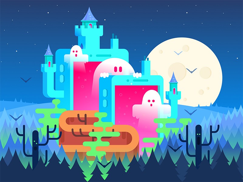
Flat design is a mainstream design approach that uses minimalistic and plain expressive visual elements. It’s regarded as the complete opposite to “rich design”, due to its simplicity, which is the basis of this style.
The most prominent feature of flat design is the use of flat, two-dimensional visual elements, in contrast to highly realistic and detailed skeuomorphic style which preceded it.
These 2D elements are usually brightly colored, with crisp edges, and put into open, clean background space.
Flat design has been developing actively during the last decade, covering more and more fields of graphic design, but its broadest and most diverse usage is still in the sphere of web and mobile interface design.


Flat Design vs. Flat Design 2.0
Flat UI design is typically favored due to its enhanced usability and visual harmony. The use of simple shapes and minimal textures is not only considered to be aesthetically more pleasing, but it also provides a more optimal user experience.
By reducing the amount of textures and shadows that featured previous, skeuomorphic style, flat design ensures responsiveness and faster loading.
However, despite its popularity, flat UI also has its drawbacks regarding the user experience.
The problem is click uncertainty – the absence of three-dimensional effects, such as drop-shadows, made links and non-links look the same, and buttons no longer look like buttons, so users don’t know what to interact with anymore.
That’s why flat design got its more balanced version, often referred to as “flat design 2.0”, or “almost flat design”.
This trend combines clean and simple visuals from flat design with some subtle elements of skeuomorphic style, such as color variations and shadows.
This increased depth and dimension improved design usability and made interfaces more intuitive.
Key Features of Flat Design 2.0
Choosing a flat look means giving up on some traditional design elements and relying on a limited toolbox.
So, you need to get creative with the tools you do have, which are listed below.
#1 Color, gradients and context
Flat design 2.0 uses more saturated hue to emphasize text or buttons, and gives users context clues to help them understand how to use certain elements (for example – placing an arrow on the right side of the page to tell users to swipe right).
Gradients are another convenient tool – they give designers plenty of space to create within the limited palette.
Combining colors and gradients creates endless possibilities.
#2 Shadows and depth
Drop shadows, raised elements and sunken buttons are especially used for calls-to-action, distinguishing elements from others on page and inspiring action from users.
These elements should be used to drive an action, not just for aesthetics.
#3 Animation
Animation and flat go hand in hand because simple, flat designs get away with simple animations more easily than detailed ones.
You can see these animations on lots of flat design websites: moving with the page, changing color on hover or action, banner sliders, etc.
#4 Simple font
Choosing the right typography shouldn’t be overlooked when creating a flat design.
A good rule to follow when choosing a font is: keep it simple and stay away from decorative elements like serifs.
Why Is Flat Design 2.0 Popular?
Flat design has many advantages that determine its popularity as one of the most flexible and artistic approaches.
Let’s review some spheres to apply its principles.
Flat Design and UI
Flat design is absolutely the most favorable approach in the field of user interfaces.
It has become equally developed in both abstract user interaction concepts and a variety of original interfaces and interface elements.
Designers widely use flat design when presenting the general concepts for UI interactions, most of all when it comes to mobile and tablet applications.
Flat mannered icons and various interactive elements are another very common field for creative effort. Simplicity of those interface elements makes them flexible in terms of responsive UI and good readability in smaller sizes.
Also, flat design illustrations are becoming more and more present in user interfaces.
Created for specific products, according to the needs of the targeted audience, flat illustrations are able to make the product work more efficiently.
Flat Design and UX
Flat design is also extremely adaptable to usability needs. By getting rid of unnecessary styling, it makes for speedier pages, cleaner code and easy adaptability. Flat design provides clear visual experience via fonts, shapes and colors and it fits nicely with any kind of medium – whether viewed on a desktop or a mobile screen, flat design is always readable and adaptable.
Flat Design and Logo Design
Flat minimalist logo design has also become the hip new thing and it’s mostly because tech giants such as Microsoft, Apple, Amazon, etc. have transformed their logos for an easier transition for user interface.
Seeing these giants going for flat logo designs influenced other brands to do the same.
One of the main reasons is that, compared to previous logo styles, flat design logos focus on clarity and versatility and reflect a modern look with vector-friendly graphical shapes.
